
Elevating Investment Expertise Through Design
Country
Greece
Industry
Investment Consultancy, Greece
Year
2018
Services Provided
Logo Design
Brand Identity Development
Color Palette and Typography Creation
Stationery and Collateral Design
Timeless Strategy: Greece Investor Guide Logo Design
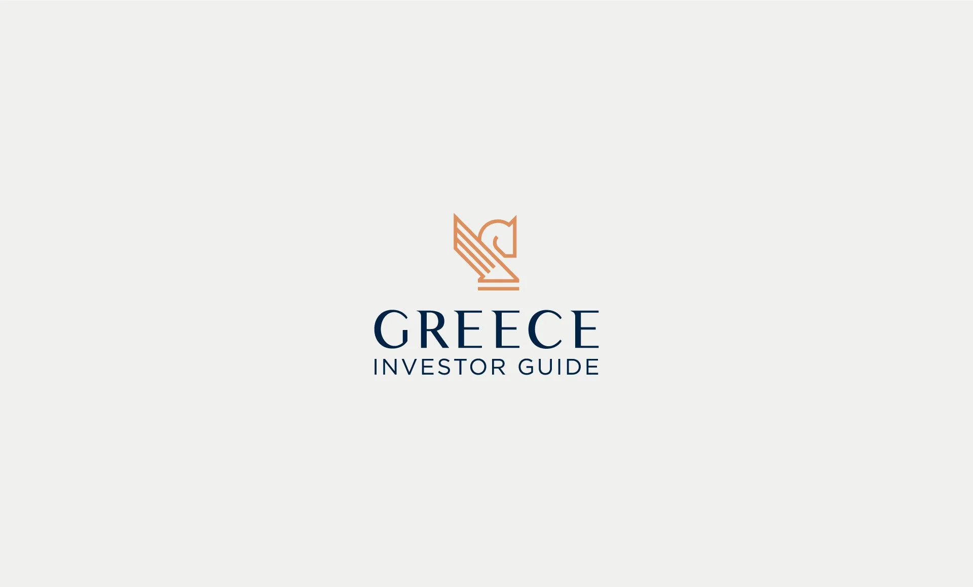
For Greece Investor Guide, we crafted a logo that harmoniously blends Greek heritage with modern strategic principles. The design reflects the brand’s expertise in investment consultancy while paying homage to its cultural roots, creating a timeless and sophisticated identity.
Logo Conceptualization: Merging Heritage and Strategy

The Greece Investor Guide logo integrates two iconic symbols:
Pegasus: Representing Greek mythology, ambition, and inspiration, it establishes a strong connection to Greece’s rich cultural heritage.
Chess Knight: A universal symbol of strategy and precision, highlighting the brand’s forward-thinking approach and expertise in calculated decision-making.
These elements were skillfully combined to create a sleek and modern design that balances tradition and innovation.
Creative Process: From Sketch to Impactful Design
The logo design process began with a thorough exploration of cultural and strategic themes. Initial sketches explored the integration of these two symbols, leading to a refined design characterized by clean lines and a modern aesthetic. The final result is a visually compelling logo that captures the essence of Greece Investor Guide’s mission.

Color Palette: Prestige and Professionalism
We employed a color palette that conveys trust and sophistication:
Bronze: Represents prestige, success, and energy.
Navy Blue: Reflects trust, seriousness, and professionalism.
This color combination ensures the logo communicates both credibility and elegance, resonating with the brand’s target audience.


Versatility in Application: Adapting to Every Platform
The design was meticulously optimized to perform seamlessly across various platforms, from digital use to printed materials. Whether on business cards, stationery, or digital interfaces, the logo maintains its integrity and visual impact.


The Greece Investor Guide logo stands as a refined synthesis of cultural heritage and strategic vision. This design captures the essence of the brand's mission—providing investment expertise with a deep connection to Greece’s historical and cultural legacy. By combining the timeless symbolism of Pegasus with the calculated precision of the chess knight, the logo resonates with both the emotional and professional aspirations of its audience.
The final design seamlessly adapts to a variety of applications, from business cards and stationery to digital platforms, ensuring a consistent and memorable presence across all touchpoints. This project exemplifies our ability to craft a visual identity that reflects a brand’s core values while establishing a strong and timeless visual foundation.


